
To build a thriving tenant community and ensure your tenant experience platform strategy is working, you need a steady stream of data flowing in from all possible customer touchpoints: Communication, retail, services and amenities, events, and more.
With this data you can better understand your tenant population, streamline operations, build better leasing strategies, improve onsite programming, inform capital improvements, and more.
With Equiem's Analytics Dashboards, you have access to the most advanced data analytics feeds in the market. This platform surfaces millions of datapoints across 11 user-friendly dashboards to give you a complete picture of your building, tenant community and tenant engagement strategy.
First, you must create and capture the data
Before data can be analysed and valuable insights discovered, you need to gather that data. Thankfully, our system is set up to do this for you, every single day.
All Equiem products are tied to our massive data warehouse: including our tenant experience apps on web and mobile, our e-commerce platform, and our flexible space booking platform. Because all the products in the Equiem suite are built in-house, we can access and surface more key data than any off-the-shelf solutions in the market.
When a customer interacts in any way with any of these products or the features within, a datapoint is sent to our warehouse. Content views and impressions, likes, comments, event RSVPs, bookings, purchases, email opens and click-throughs - all these actions produce datapoints.
From there, all of your datapoints are synthesized and surfaced in our Analytics Dashboards. They appear to you in the form of helpful visualisations. These visualisations are updated daily, putting fresh data alongside lifetime data for in-depth analysis.
Simply view the visualisations, analyse and compare the findings, and make iterative improvements to your building community. Test your improvements, analyse again, repeat.
With a little help from Equiem's tenant engagement specialists
We understand that the world of analytics can be daunting. Our Engage specialists are trained data scientists, on-hand to help you analyse your data and develop meaningful insights.
Every month they can help you to make programming, content, and other asset-specific recommendations to help you drive engagement, retention, and leasing.
Second, you need to view and analyse the data
Equiem's Analytics Dashboards have been designed specially for landlords, building management teams, leasing teams, and more.
You should never have to wade through walls of meaningless numbers and inscrutable graphs to get answers. Whether you have a single building or an entire portfolio, you can easily view, analyse, and benchmark your data.
The platform comprises 11 dedicated dashboards, separated for ease of use and analysis.
The 'Last 30 Days' and 'Overview' tabs give you a quick-glance report on the last month of activity across your platform and products. Here you can easily see active usage rates, new registrations, retention rates, and more. Compare recent activity with longer-term trends.
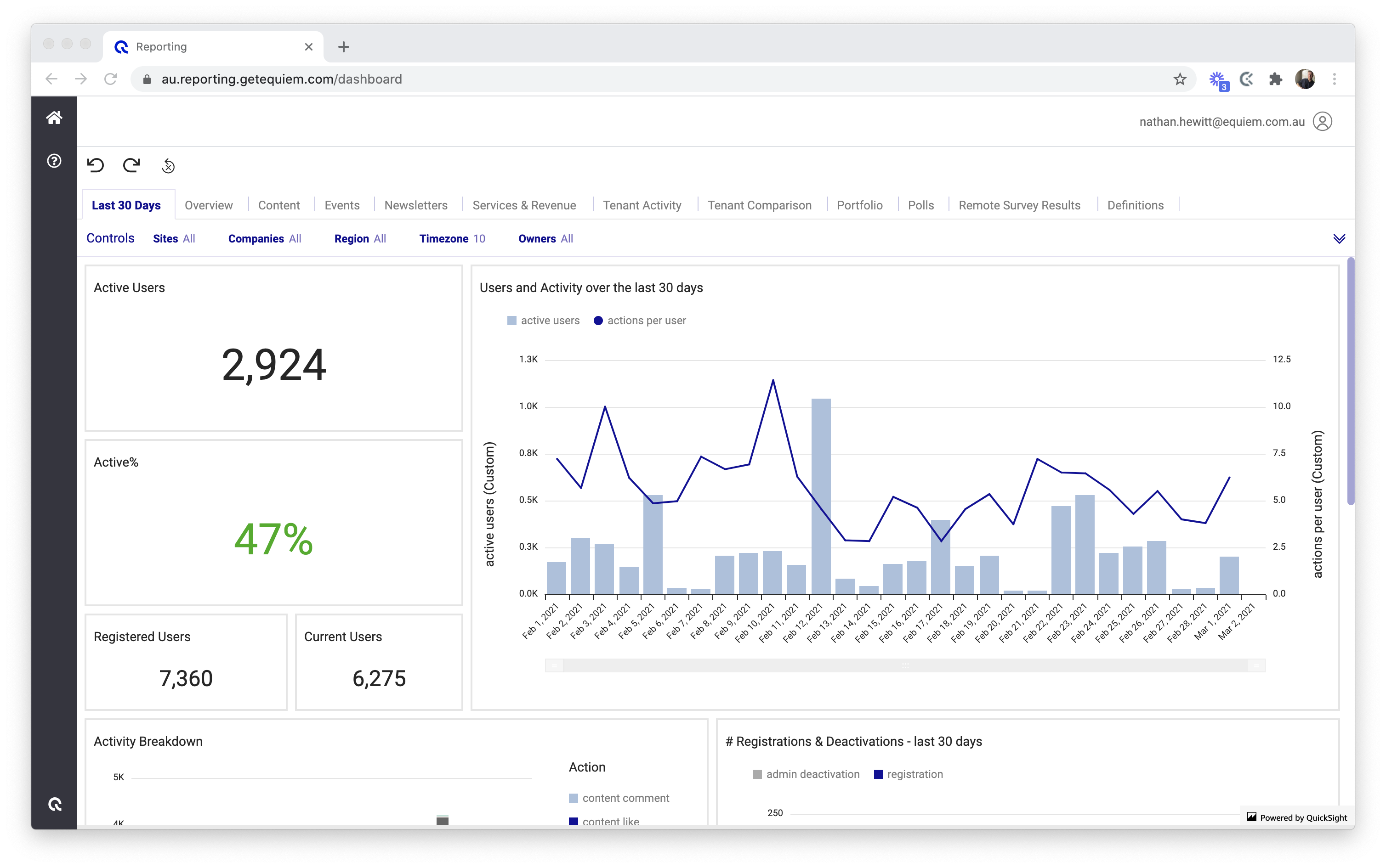
The Content tab gives you comprehensive results on your content strategy: post views, likes and comments; performance over time, readership habits across company, building, and time of day, and much more. Here is also where you can check on newsletter performance, including open and click-through rates. All of this helps you to optimize your content strategy so you can keep your tenants engaged.
The Events tab gives you instant feedback on the performance of your event engagement: RSVPs, attendees, the most popular events by time, date and season, and more. Optimize your onsite programming based on event attendance by company to maximize your event budgets or tailor your programming to your unique tenant mix.
Under the 'Services & Revenue' tab, you can see the performance of your e-commerce platform. Data on vendor revenue, Space bookings, popular store items, customer peak periods, and more all appear here. Understand the utilization of onsite amenities and the health of your onsite retailers, and develop strategies to generate revenue through onsite amenities and services.
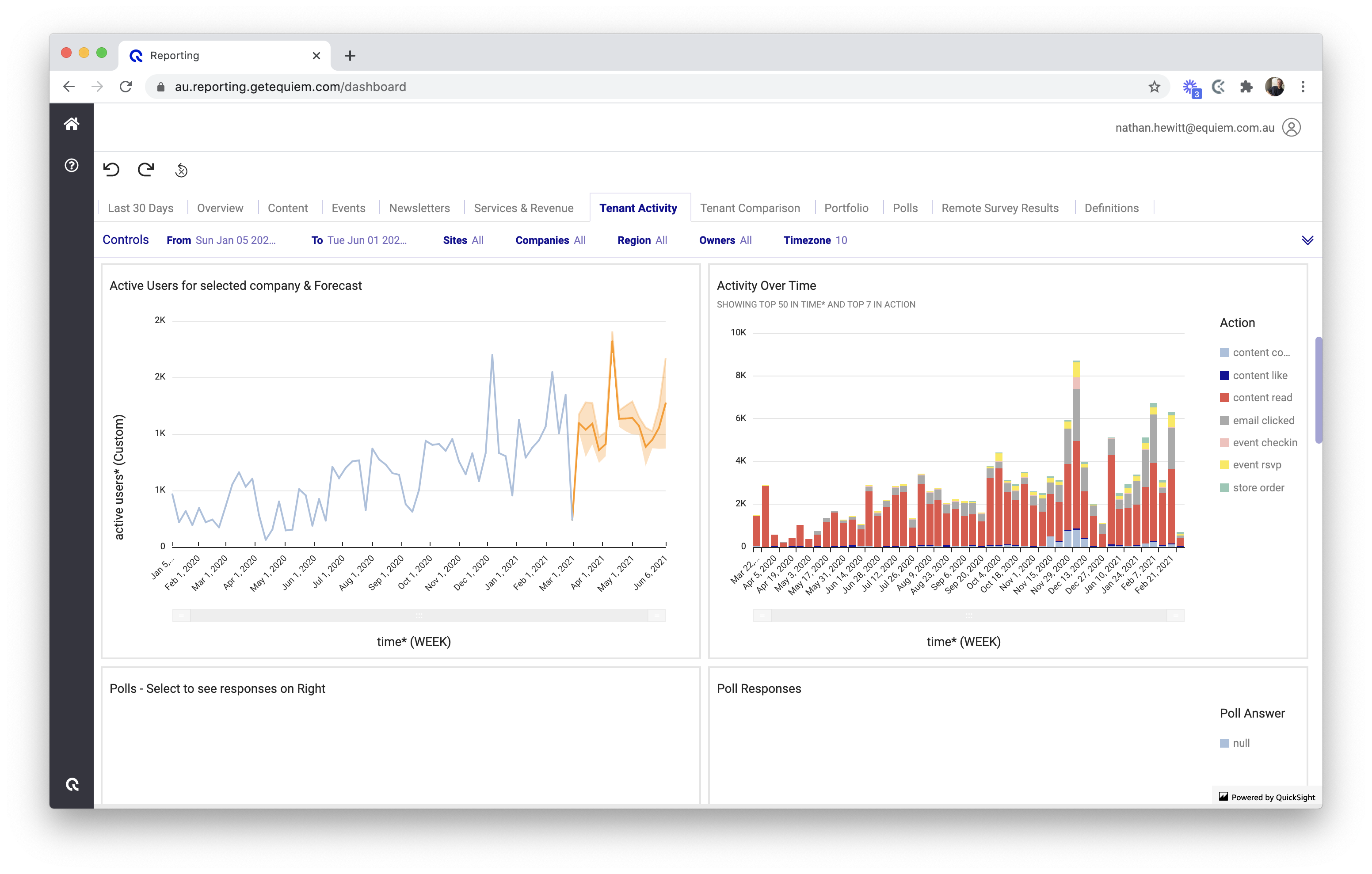
The 'Tenant Activity' and 'Tenant Comparison' tabs enable you to dive deep into the companies at your buildings. Look at what your individual tenants are doing, how they are feeling, what content they are reading, and more. Compare and contrast tenant behaviours to improve your engagement strategies. You can even compare tenancies or entire buildings across your portfolio to uncover new actions.
In conjunction with our 'Leasing' tab, you can build an accurate profile of tenants that will assist you in leasing discussions and renewals. This dashboard shows you clearly when companies are up for renewal so you can strategise far ahead of time.
The 'Polls' tab takes results directly from polls you conduct on your platform. Ask tenants directly what they think, want, need, or even how they're doing, and get instant qualitative responses delivered to you. Polls are completely customisable and the findings are invaluable.
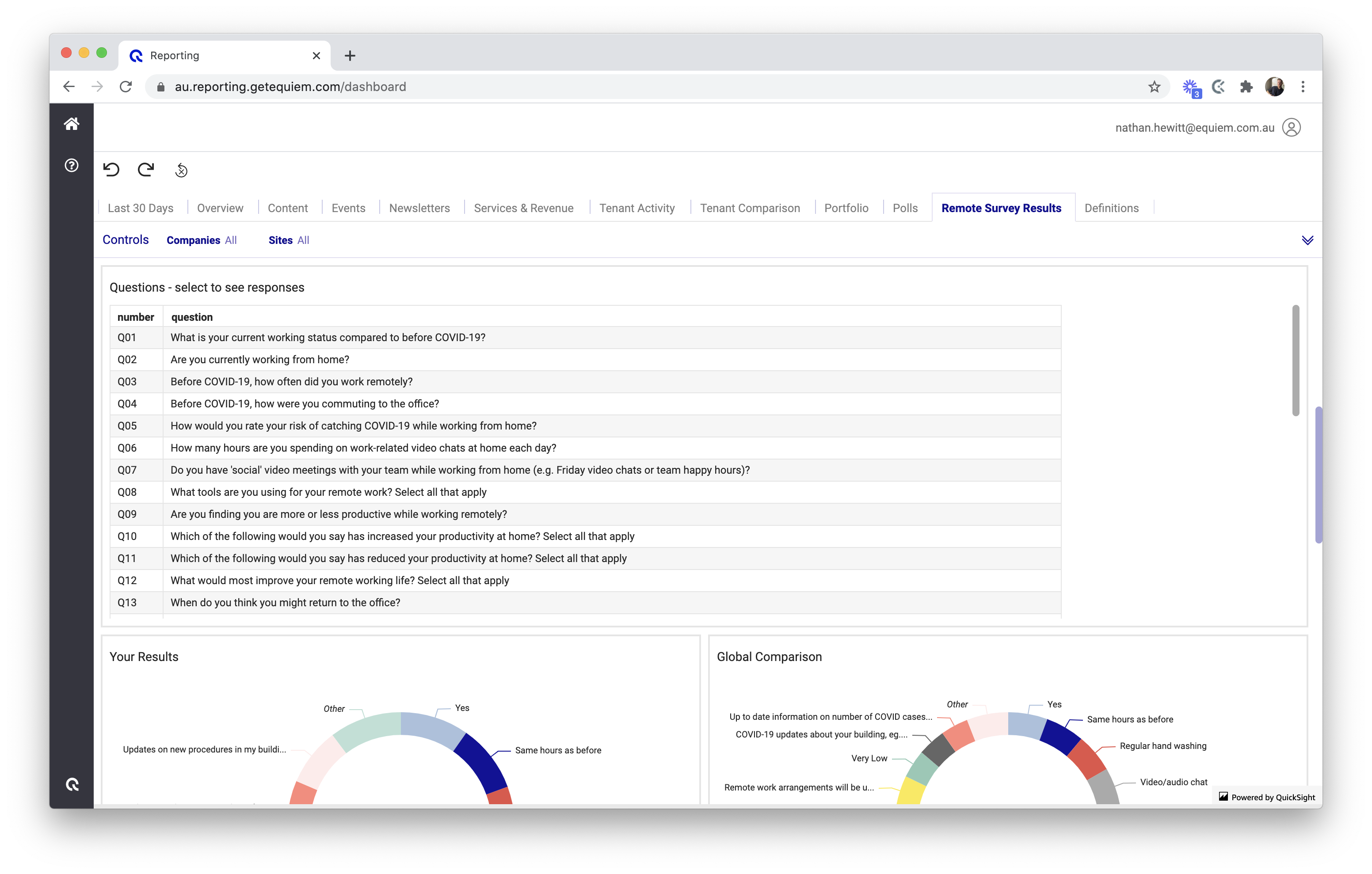
Even better, we can benchmark your tenant's responses against global poll and survey results. Our global portfolio of clients and large user base enables you to see global benchmarks and compare how your asset and tenants compare to global trends.
There are more Dashboards to explore across the platform - including 'Newsletters' and 'Portfolio' - designed to bolster your tenant engagement strategy. And we are constantly adding new tabs and visualisations to increase your knowledge and learning potential.
Finally, you slice and dice
A unique benefit of our Analytics Dashboards is the level of control it gives you to analyse and dissect your data.
New users will find the interface easy to navigate and use. The control bar at the top allows you to change your analysis parameters: date, time, buildings, companies, and more.
Users experienced with other analytics platforms, like Google Analytics, will find similar control over visualisations and can dive deep into the data if they choose.
Many visualisations and numbers can be easily exported to CSV files for sharing - but access can be easily given to your team.
All stored and presented data is safe, secure, and anonymised. Equiem is fully compliant with GDPR and PCI-DSS, so you have complete peace of mind.
To see our Analytics Dashboards in action, check out this explainer video below. It just may change the way you approach tenant engagement.
Topics:
Engage


.jpg?width=461&height=400&name=Untitled%20presentation%20(1).jpg)