
This content series on actionable data is designed to help you analyse and enhance your engagement strategies, whichever platform or solution you use. This time, we're looking at visits per user, as well as three unique email newsletter interaction metrics.
With the right data, you can uncover more about what your tenants want and do than they could ever tell you. In our last post, we looked at the highly-useful Interactions Per Visit (IPV), cohort analysis, and "activity at time of day" visualisations.
To make use of all of these analytics, you need a system that will formulate them and present them to you in a user-friendly format.
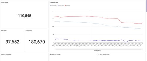
Unique visits per user (VPU)
Let's say that your MAU (Monthly Active User) rate is 30%, which means that 30% of the registered users on your platform visited at least once in a given month. The higher an MAU is, the better — but MAU alone is not enough to determine whether your online community is healthy and useful.
300 users (out of a possible 1000 total users) may visit your platform at least once in a given month, but how many more times do they visit? You can only know that by assessing the amount of unique visits per user.
An average VPU of 7-10 tells a much different story than a VPU of 3-4. A high VPU indicates that your active users are very active, on average. Most come to your platform, regularly, of their own volition. Maybe they visit to interact with the latest content, to chat with peers, RSVP to events, or use digital amenities.
Of course, a low VPU (around 3-4) tends to indicate the opposite. Dig deeper, and you may find that your cohort of 300 active users is split between active contributors and idle browsers. For instance, a minority of visitors may return 5-6 times, and the majority may visit only once.
What can you do about a low VPU? Investigating your traffic entry points is a good place to start. Weekly email newsletters may be a great tool for reminding users to log in, but if the content impressions you offer are not compelling enough, many will not stay or return for self-directed browsing. They will pop up momentarily, log an MAU datapoint, and then leave until prompted again.
If your VPU is low, and emails are your main generator of traffic, try running a split-test of subject lines with segmented user groups. Consider also that your content headlines may need sprucing up. Or, perhaps you need to inject some novelty: For instance, regular comment-to-win competitions, in which users must regularly check back on a piece of content. Should all else fail, you may need to re-examine the wants and needs of your tenants to formulate a content offering that better encourages organic exploration.
Unique email newsletter interactions
Even though it is just one tool in your communication kit, a well-planned and executed email newsletter strategy can maintain and bolster the week-to-week momentum created by your engagement activities. The ultimate goal is for users to visit the platform, daily, without being prompted — but a subtle weekly reminder, in the form of a "current events" wrap-up, can build that behaviour over time, increasing both your MAU and VPU all the while.
Email and content marketers are constantly theorising about what makes a compelling email newsletter. HubSpot, for instance, has a host of design features and messaging suggestions (most of which, by the way, are built into Equiem's newsletter creation tool). However you choose to communicate with your tenants, there are three time-honoured metrics to track, in order to assess performance and make improvements.
Open rate
The percentage of users that opened your email. If your platform has 100 users, and 10 of those users open your newsletter, you have an open rate of 10%.
A "good" open rate is difficult to benchmark, as it is dependent on many factors (like demographics and send-out times), but anywhere from 20-30% for a weekly newsletter is reasonably healthy.
If possible, create your own benchmark using your first newsletter. Over time, your open rate should either remain steady (as tenant populations and demographics change), or it should grow slowly. If you have weekly or monthly dips, though, don't despair — the game of newsletter growth is often played over many years.
Click-through rate (CTR)
Your CTR is the percentage of users who clicked a link in your email. This number is usually reached by dividing total email clicks by the total number of emails delivered. But your analytics dashboards should be able to dive deeper, separating your unique CTR from your total or holistic CTR.
Unique CTR works like this: You deliver 100 emails, and 10 people click on the links in the email. You have a unique CTR of 10%. Unique CTR is the most commonly tracked CTR metric.
Total CTR works like this: You deliver 100 emails, and 10 people click on two links each. Your total CTR would then be 20%.
According to emailout.com, the average CTR is around 4%. Your mileage may vary.
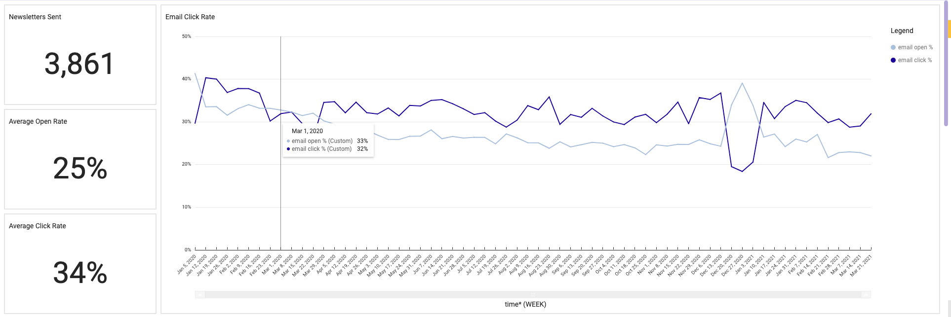
Click-to-open-rate (CTOR)
Your CTOR is similar to your CTR, but the fundamental difference is in the denominator. To find your CTOR, you divide the number of newsletter link clicks by the number of users who actually opened the email, not the amount of emails delivered.
So: You send your newsletter to 100 users, and 20 users open the email. Across those 20 users, your newsletter links receive 5 total clicks. That gives you a CTOR of 25%, next to a CTR of 5%.
Why are these metrics important? They help you diagnose problems, and prescribe improvements, based on the relationship between lows and highs. For instance, a low CTR and high CTOR might suggest that your newsletters have compelling content, but that content is ultimately appealing only to a small proportion of your building community. The inverse — a high CTR and low CTOR — might suggest that your newsletter subject lines are attractive, but users aren't finding anything of value when they click through.
Speaking of subject lines, here's a bonus tool you can use to optimise the strength of your newsletters (and reach higher CTRs): CoSchedule's Headline Analyzer. To use this free tool, simply draft up and place your headline in the bar and click "Analyze Now". You will receive a complete read-out on the power of your chosen headline, based on type, word balance, sentiment, character length, and other parameters. Use it in your mission to craft better content for your tenant community.
Equiem's Core tenant experience platform solution comes with our Analytics Dashboards product, which provides you all of the analytics above (and many, many more). If you want more data, or need ways to optimise your successful engagement strategy, we can help. Book a consultation with us today.
Topics:
Engage


.jpg?width=461&height=400&name=Untitled%20presentation%20(1).jpg)